

CIFWI
WEB DESIGN | FREELANCE UX PROJECT
Improving the user experience of a mental health non-profit website homepage
My Role & Responsibilities
Project Management: Planned and coordinated project timeline
User Research: Google Analytics, User Interviews
UX Design: Sketching, Wireframing
Development: WordPress Implementation
Project Context
January - July 2022
(7 months)Team of 5: 1 UX Designer (Me), the Director of CIFWI, 1 Illustrator, 1 Web Developer, and 1 CIFWI Volunteer
Tools Used

Figma

Loom

Google Analytics

WordPress

Suite

Notion
BACKGROUND
The Chinese Immigrant Families Wellness Initiative (CIFWI) is a program aimed at promoting mental health among Asian immigrant families in Philadelphia.
Launched in 2020, CIFWI partners with trusted local mental health professionals and community workers to provide culturally sensitive services to address language barriers, cultural stigma, and limited access to mental health resources.
OVERVIEW
I joined CIFWI as a volunteer UX freelancer and led the redesign of their website's homepage. Over the course of 7 months, I worked alongside a team of 5 to execute the project from user research to design implementation.
The website redesign was primarily focused on improving user navigation and updating the branding to showcase the organization's mission and values effectively. As CIFWI's website was outdated, its users found it challenging to find the information and resources that they needed.

PROJECT PLANNING
To get started, I found it important to get the team on the same page with the redesign expectations, goals, approach, and limitations.
As this was a semi long-term project, I drafted up a loose timeline to go off on. My primary concern during this process was making sure that the expectations we settled on were realistic and manageable, given the limited resources of CIFWI, as a non-profit organization.
The 3 Primary Goals for the Redesign:
To improve the overall UX of the website by making information more accessible, and increasing the visual appeal to better represent CIFWI's mission and values.
For this Project, there were 4 Initial Design Constraints & Requirements:
Due to limited time and capacity, the redesign will primarily be focused on the home page of CIFWI's website.
To make maintenance easier post-revamp, the WordPress template of CIFWI should not be changed.
The website should embody diversity, a sense of community, and should not feel corporate.
The main design color candidates are yellow, red, and blue, reflective of CIFWI's current branding.
INITIAL WEBSITE ANALYSIS
In order to better understand CIFWI and it's offerings, I conducted a heuristic assessment and presented my initial sweep of concerns on the site's current layout, site navigation, spacing, and UI.
This was helpful to bring the Director on the same page on some of the initial design concerns that I had, when evaluating the site against recommended design principles.
Heuristic Assessment
(*Note: Click the arrows to view other slides in the carousel)


To test the initial assumption of the site's target audience being older millennials, I analyzed CIFWI's Google and WordPress Analytics. Surpringly, this revealed that CIFWI's website audience mainly consisted of a younger user demographic.
This was a key turning point in our design process, as the initial assumptions of an older immigrant Millenial target audience has resulted (up to this point) in a strong preference for an “Eastern” web design style from the Director. This new data point allowed me to propose a new design direction suitable for a younger demographic.
USER INTERVIEWS
With the analytics data, I still needed direct user feedback to understand how CIFWI's current users use and navigate the website. I then interviewed 4 involved members of CIFWI's community to hear about their experiences and impressions.
Their Input Revealed 3 Key Themes to Improve On:
Links to different pages that are provided in various sections of the home page seem random and unintuitive.
Stylistically, the home page looks outdated and lacks enough media (pictures, etc.) to balance out the text.
IDEATION & WIREFRAMING
Based off of the research insights, I focused the redesign in three areas: 1) Web copy, 2) Nav menu restructuring, and 3) Home page layout.
The Layout of the Home Page was Updated to Reflect
the Key Information that was Noted to be Missing in User Research:

UPDATED UI & BRANDING
CIFWI did not have a style guide in place, so I redesigned the UI and polled the community for feedback, resulting in a branding that's focused on being welcoming, friendly, and diverse.
It was important to involve CIFWI members to see what they think best represents them. Thus, a color scheme of blue and yellow was selected. Out of the 3 initial color preferences, red was not chosen due to the association of light red as being too "feminine" while dark red was too intense.


COLLABORATING WITH AN ILLUSTRATOR
During the development of UI assets, I worked with a local artist to design an illustration that accurately reflected the problem that CIFWI was targeting.
This collaboration with Justine Kelley took place over the span of a month, and involved discussions on conceptual ideas of the piece and multiple rounds of feedback on drafts to arrive at the final product that's currently displayed on the home page.
RESOURCE REVAMP - THERAPIST LIST
The AAPI Therapist List was a key resource that CIFWI offered and wanted to highlight. The list was updated by a CIFWI volunteer, and I tested the updated version with CIFWI's Director for potential pain points.

WORDPRESS IMPLEMENTATION
While building out the website in WordPress, I encountered some unexpected constraints from CIFWI's existing template, which resulted in 4 key design changes.
CIFWI's website is hosted in a very basic WordPress template, which meant very limited design customization.
Throughout this process, I consulted with CIFWI's volunteer web developer on advice to the roadblocks, and brainstorming together alternative solutions.


FINAL PRODUCT
Want to check out the redesigned CIFWI website yourself?

"Shirly helped revamp our organization's website (www.CIFWI.com). She is creative, detail-oriented, responsible, collaborative, and truly a joy to work with. Throughout the 6-month project, Shirly conducted a comprehensive website assessment, developed a timeline with realistic goals and target dates, organized meetings with multiple project partners including the illustrator, web developer, program participants, and supporters. She created and implemented the new design of our website. We cannot be more happy with the final product, as the website accurately reflects the culture of our organization."

Esther Hio-Tong Castillo
Director of CIFWI
CONCLUSION
Things that I learned and/or would do differently next time…
Everyone has assumptions, so it's always important to advocate for the user - Sometimes when working with clients, disagreements on different design directions are normal. I learned that it's important to advocate for user research and strive to back up design decisions through data to make sure that the user's needs are being met.
If I had more time, I would do additional user testing to gather feedback on the redesign - While we did not have time to gather user feedback on the redesign, doing so would be beneficial to further benchmark the success of the revamp.
MOBILE UX DESIGN
USABILITY TESTING | CASE STUDY
HireScoutr
Refreshing the job applicant experience for a recruitment software start-up
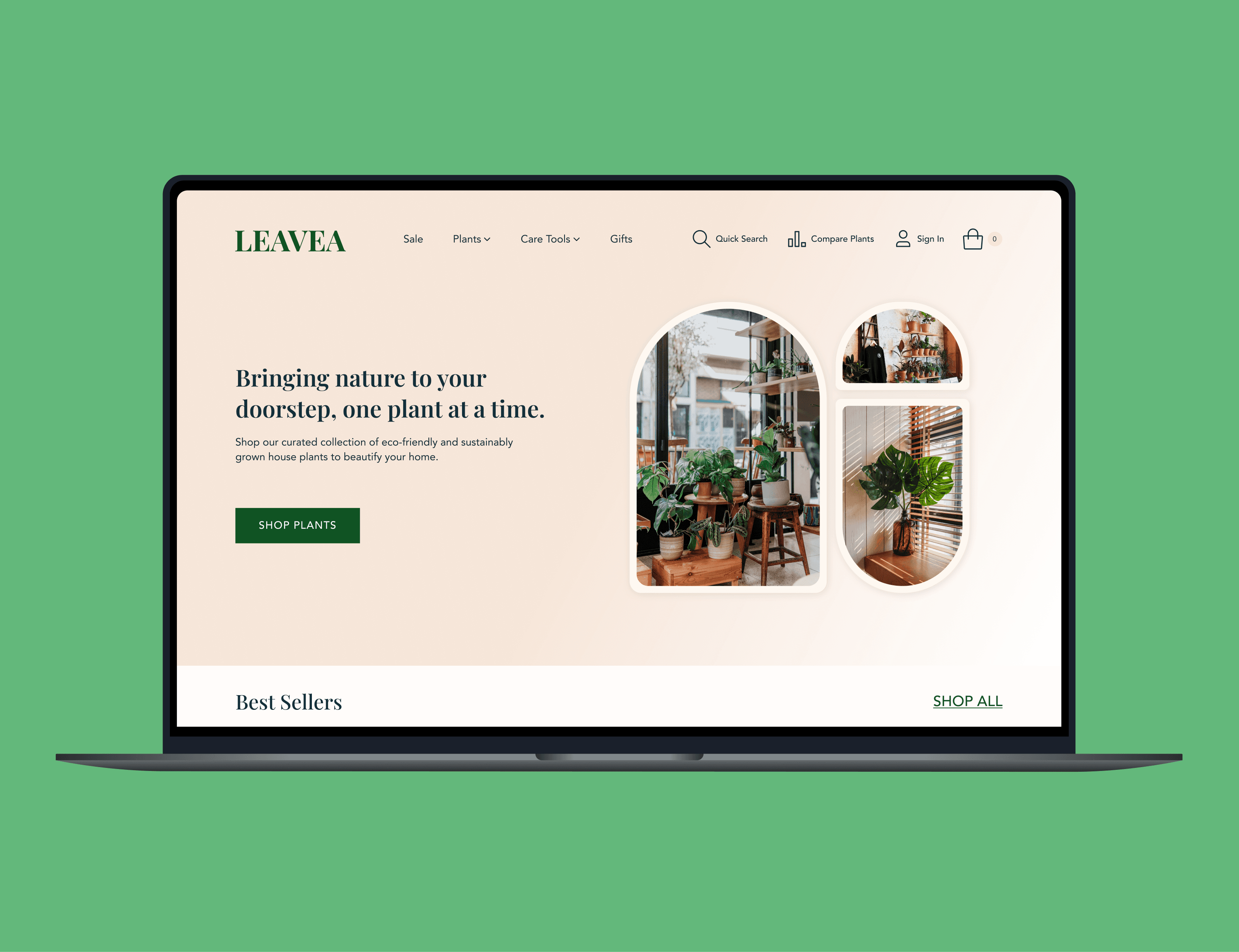
WEB DESIGN
Leavea
Improving product comparison on a house plants e-commerce website
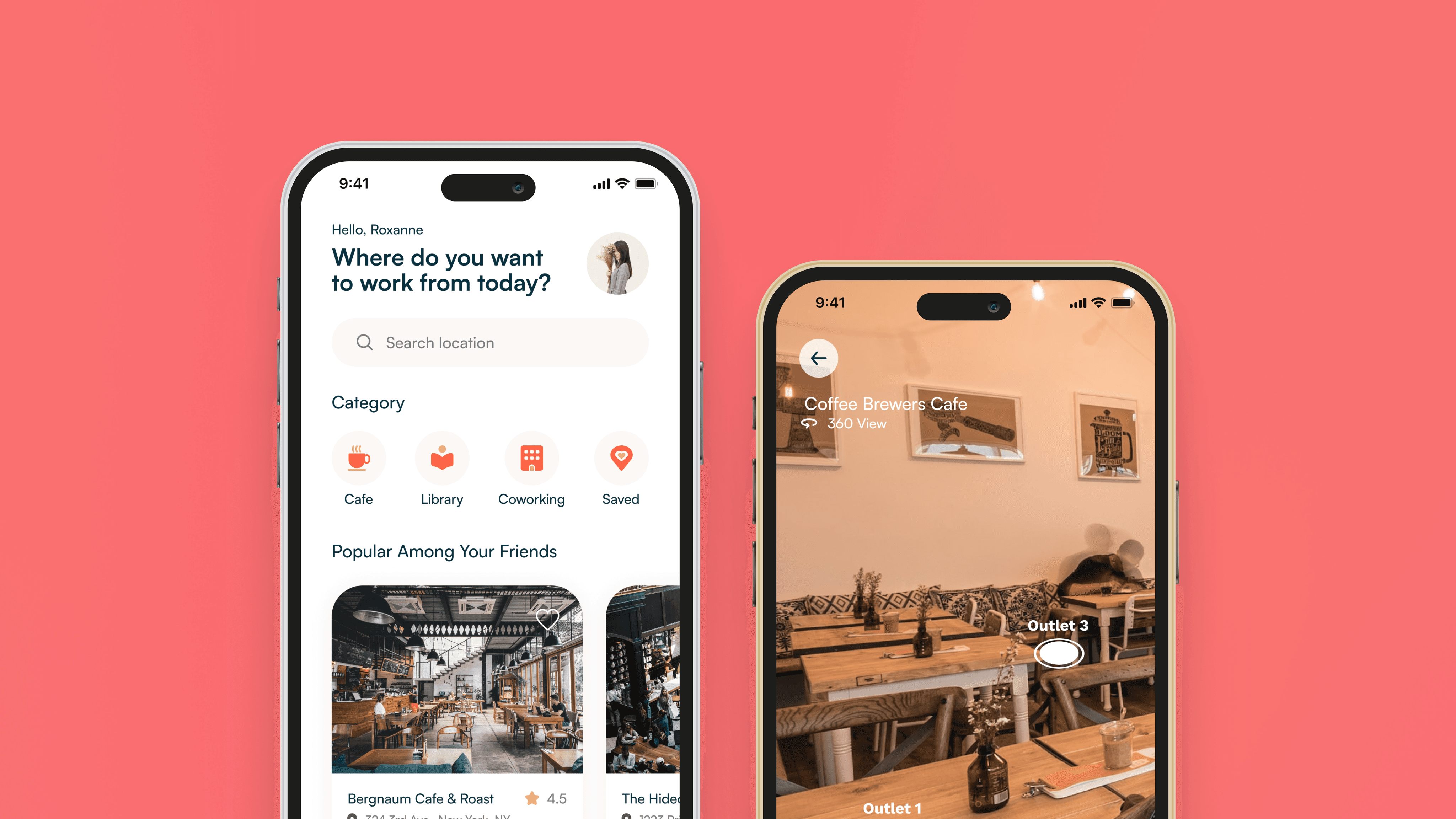
DESIGN SPRINT
PostUp
Helping remote workers find cafes and public spaces to work from