

Leavea
E-COMMERCE WEB DESIGN
Improving product comparison on a house plants e-commerce website
Role & Responsibilities
UX Design: User Research, Heuristic Analysis, Sketching, Wireframing, Prototyping
Usability Testing
Project Context
1 Month
Solo Project
Tools Used

Figma

Calendly

Suite
OVERVIEW
Leavea is a house plants e-commerce website that needs to enhance their browsing and checkout experience to increase checkout conversion.
Recently, Leavea has observed that 50% of their users open on average 7 item pages and then abandon the site without moving any items into the cart, suggesting that users are unable to determine which plant is best for them.
Additionally, 70% of users who add a plant to cart do not purchase. Data reveals that users abandon their carts at the registration page, due to a lack of guest checkout.
THE SOLUTION
An e-commerce website with a plants comparison feature to aid users in product decisions to increase purchase conversion.


HEURISTIC & COMPETITIVE ANALYSIS
Before conducting primary research, I did a heuristic analysis on the current website wireframes and identified a lack of necessary content for plant purchasing decisions.
Heuristic Analysis

Analyzing competitor house plants websites such as The Sill, Bloomscape, and Lively Root revealed UX patterns such as a side panel checkout page and guest checkout as common for the houseplants e-commerce industry.
Competitors


USER INTERVIEWS
Next, user interviews provided first-hand insights into user browsing habits. When asked to find a plant to purchase, users would open multiple tabs of products, or compare products side by side in the process.
What that in mind, I began to put together a potential user flow that addressed the concern for product comparison and guest checkout.
User Flows

SKETCHING & IDEATION
During the sketching process, I experimented with product comparison layouts. My goal was to draw inspiration from the table layouts that currently exist in the market as a starting point for user familiarity, and ideate from there.
Example Sketches

WIREFRAMING
Next, I then moved on to low-fidelity wireframes, focusing on a smooth browsing process with webpages that had all the content sections that users expected.
Example Sketches

TESTING AND IMPROVEMENTS
After 3 rounds of user testing on the new website prototype, there were 3 main changes to Leavea:


FINAL MOCKUPS & PROTOTYPE
Want to check out Leavea yourself?
Final Mockup of the Home Page

Final Mockup of Product Listing Page

Final Mockup of Product Details Page

Final Mockup of Product Comparison page

Final Mockup of the Checkout Page

CONCLUSION
Things that I learned and/or would do differently next time…
Habits sometimes can’t be expressed, but can be observed - I learned that it’s hard to know what users will actually do when browsing online, but observing them in the process of it revealed the most insights instead of asking them to describe their experiences.
Scope is important to keep in mind when designing from the start - Given the nature of the time limit on this Capstone 2 project, in the beginning it was so easy to add additional features and scope in the design when instead, I learned that it’s not needed.
It’s okay if the designs aren’t perfect - This project taught me that sometimes I can’t go back and perfect everything, which is okay. It really forced me to focus on what’s truly important for the prototype instead of all the small details.
MOBILE UX DESIGN
Connectic
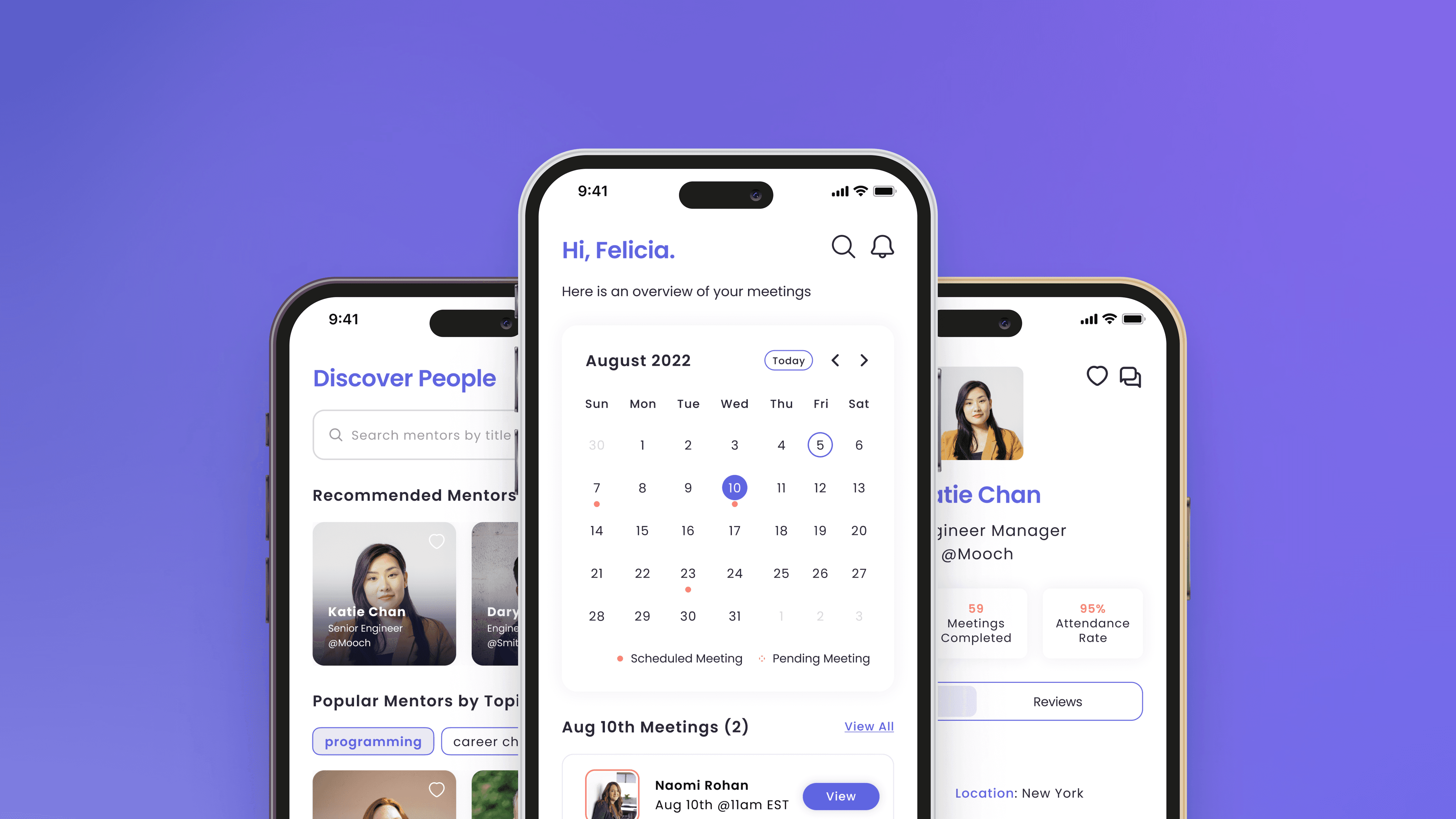
[2023 Indigo Design Award Winner] Improving access to mentorship opportunities for early career professionals
USABILITY TESTING | CASE STUDY
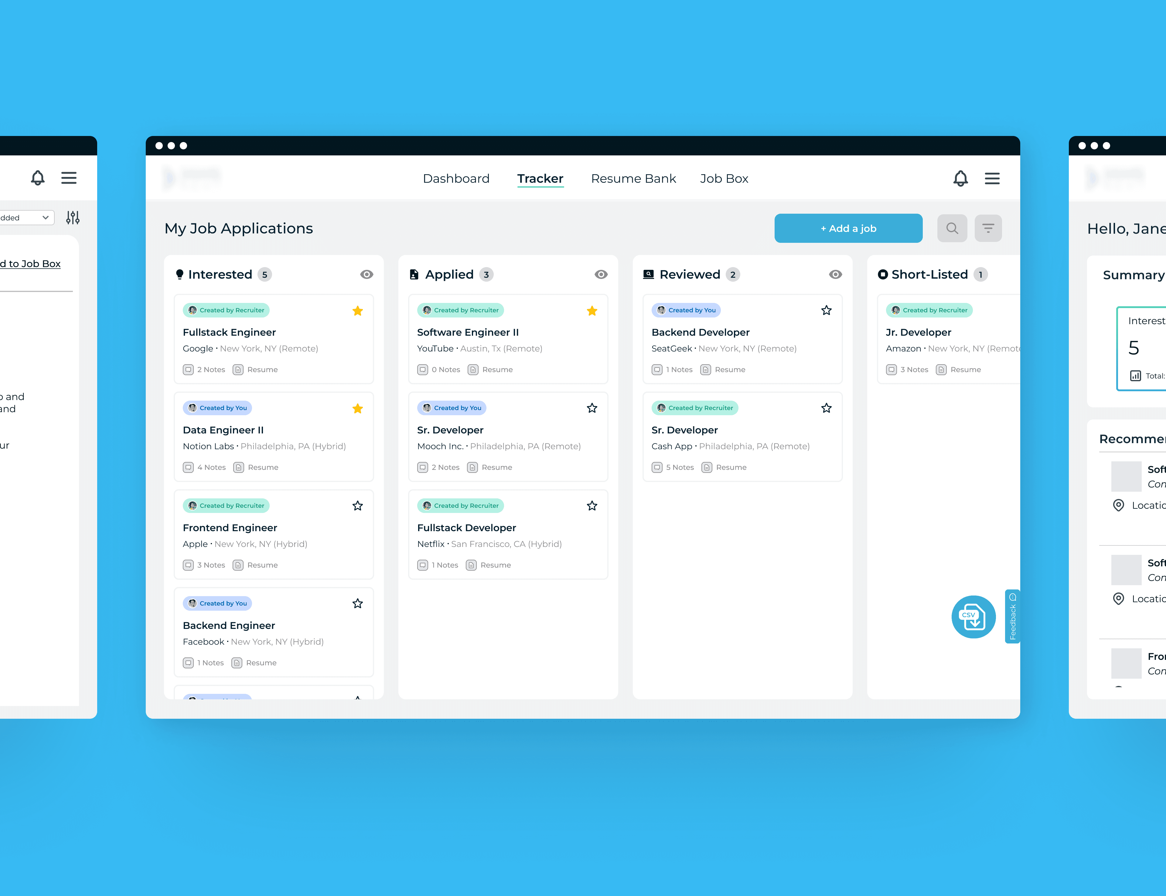
HireScoutr
Refreshing the job applicant experience for a recruitment software start-up
WEB DESIGN | CASE STUDY
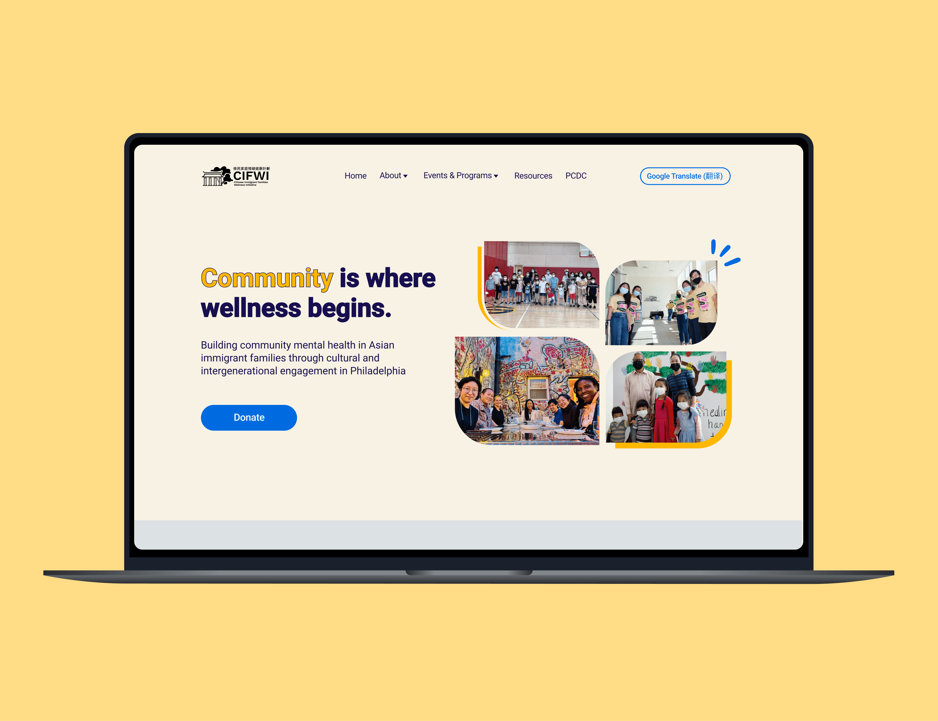
CIFWI
Homepage redesign for a mental health non-profit organization based in Philadelphia
DESIGN SPRINT
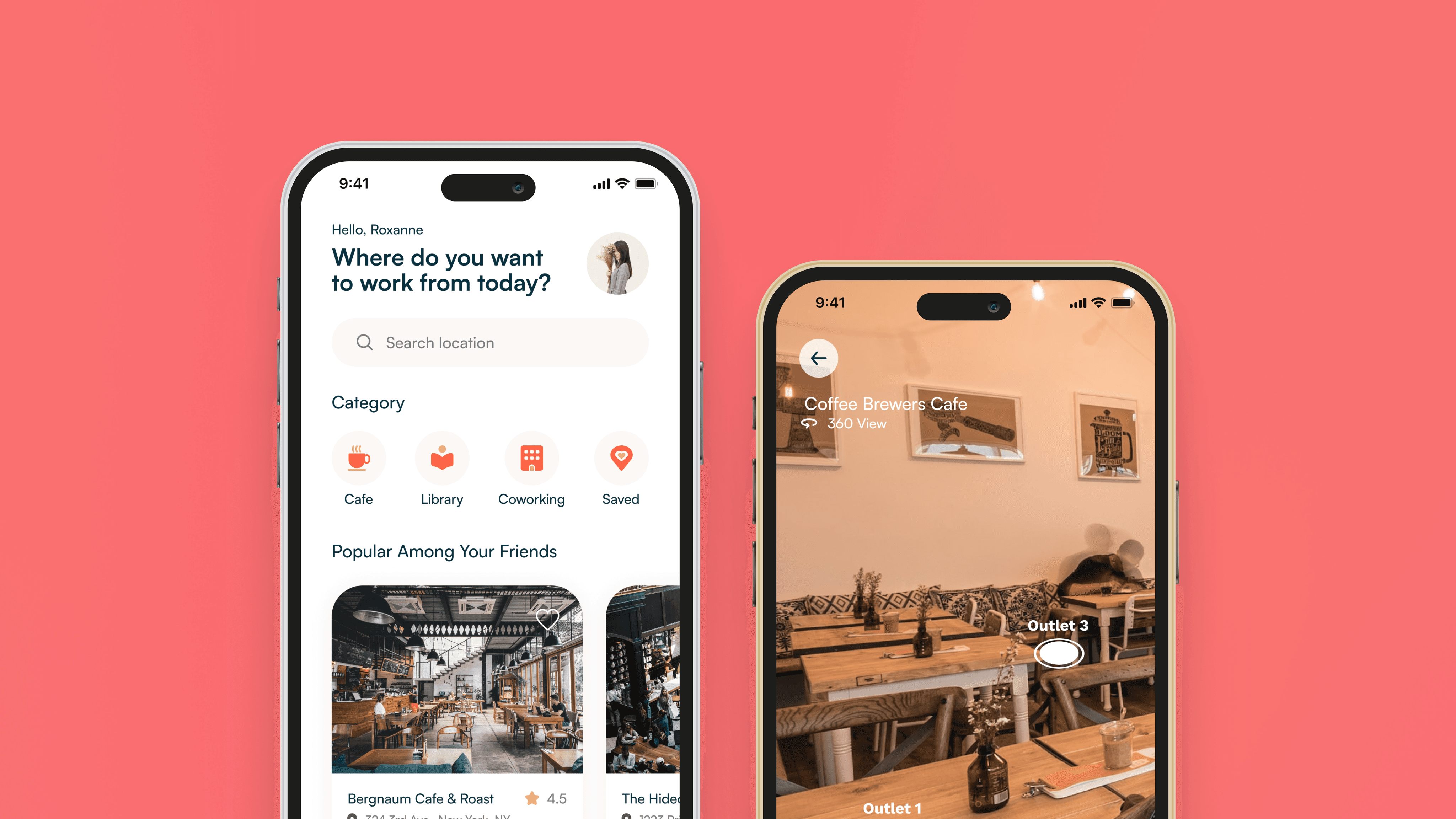
PostUp
Helping remote workers find cafes and public spaces to work from