
PostUp
GOOGLE DESIGN SPRINT
Helping remote workers find cafes and public spaces nearby to work from
Role & Responsibilities
Market Research
UX Design: Crazy 8s, Wireframing, Prototyping
Usability Testing
Project Context
5 Days Design Sprint
Solo Project
Tools Used

Figma

Calendly

Suite
OVERVIEW
PostUp is a start-up that has recently seen a lot of feedback and discussions from its community of users around the difficulty of finding good public places to work from.
As a platform where freelancers and remote workers share tips and advice with each other, PostUp saw this feedback as an opportunity to address a key user need. Their users want to easily find places to buckle down to get quiet work done, take a phone call, or have a quick meeting.
As a result, I was tasked with creating a mobile app, and ran a design sprint to quickly test out potential solutions.
THE SOLUTION
A discovery app that helps remote workers locate great cafes and public spaces nearby that suit their working needs.


DAY 1: UNDERSTANDING THE PROBLEM
Remote workers find it difficult to search and know which public places have suitable amenities, appropriate working environments, and are not crowded.
To design an app that effectively meets users' needs, it is important to understand their challenges and preferences. There were 4 key themes of user frustrations that I uncovered after synthesizing the research provided in the project brief:
Four Key Themes of User Frustrations
It is time consuming to find potential working spots.
Users often spend more time looking for a place to work than actually working, which can be stressful.
When a place is found, there are unwanted surprises.
Users will settle in, only to realize the wifi is unreliable, there are no restrooms, or they can't stay as long as needed.
It is hard to know if a space is suitable for working.
Most of the reviews and photos are geared towards food and drinks, with limited information on amenities.
There is no way to know how crowded a place is.
Users typically find out that a place is crowded with no open spots after arriving, which can be frustrating.
Research Highlights on Users' Experiences
“I like to know how crowded a place is - If I’m doing independent work, I don’t want it to be super loud. If I’m meeting clients or coworkers there, I want to be sure we can get a place to sit and talk for a bit.”

James
Participant 5
“I usually look at pictures of the place before I go, just to make sure there’s enough room for me and my coworker to take a table without feeling guilty.”

Adam
Participant 9
“If a place as Wifi, outlets, and bathrooms - that’s all I need. If I need to buy some food or coffee to stay there, I really don’t mind. Bonus points if their coffee and food are actually good!”
Claire
Participant 6
“I like to find places where other people go to work - they’re usually more friendly towards me setting up my laptop and working. I like places that are used to people working there - I don’t have to get nervous that I’ll be asked to leave while I’m in the middle of my work.”
Beth
Participant 8
PostUp also provided 3 design constraints which I kept in mind, when brainstorming a solution that balances both business and user needs.
DAY 2: IDEATION
I focused my ideation on how users can quickly discover places while easily assess relevant factors, in order to come to a decision with minimal surprises along the way.
This resulted in a user flow that streamlines the search process and provides remote workers with the information that they need.

Results from lightning demos suggested a main map view as a common layout that allowed users to discover and connect with places.
I analzyed a variety of existing travel, real-estate, and food related apps in the market for common UX patterns and interaction that may be helpful to PostUp for design inspiration..

I then sketched variations of the main screens using figure 8 exercises for a quick and iterative process.
My goal during this process was to generate as many ideas as possible before funneling down to the best solution that fits the user's needs.

DAY 3 + 4: DECIDING & PROTOTYPING
PostUp's style guide used earthy colors that are common in cafes, resulting in a warm, open, and welcoming branding.
I kept the style guide simple in order to focus on fast design iterations to quickly build a working prototype for testing.
DAY 5: TESTING
After one round of testing, 3 major changes were made to improve usability of PostUp.
Usability testing was conducted with 10 participants split between the mentor and mentee user types of Connectic. My area of concern prior to testing was the layout of the search and filter process, and this was confirmed to be true during testing.
1) Users want distance to be even more emphasized in their search.
Distance is the #1 factor that mattered the most to users. They wanted to see distance in card previews as well as in the profile, not just on the map.
2) Users need to be incentivized to complete the check-in process
Some users admitted that they would have forgotten or would have liked to skip over the survey. Therefore, ideas to improve include gamification and a rewards system.
3) More clarity and placement of certain unknown icons are helpful
The 360 button was often not noticed on the top right. Users thought the people icons meant these people are currently at the place when in reality it’s to indicate that these people have checked in here before.

CONCLUSION
Additional thoughts and things I've learned…
My thoughts on pricing the app - Shop owners are charged a monthly subscription to be verified on the app, and in turn they get promoted on the app, which drives traffic for them. Users can also be charged a monthly subscription to access information on this app.
Clarification is important - I learned that it’s better to be extra clear than to leave it up to users to figure out what something means in an app.
It’s okay if the designs aren’t perfect - This design sprint taught me how to iterate and work in strict deadlines. This meant that sometimes I can’t go back and perfect everything, which is okay. It really forced me to focus on what’s truly important for the prototype instead of all the small details.
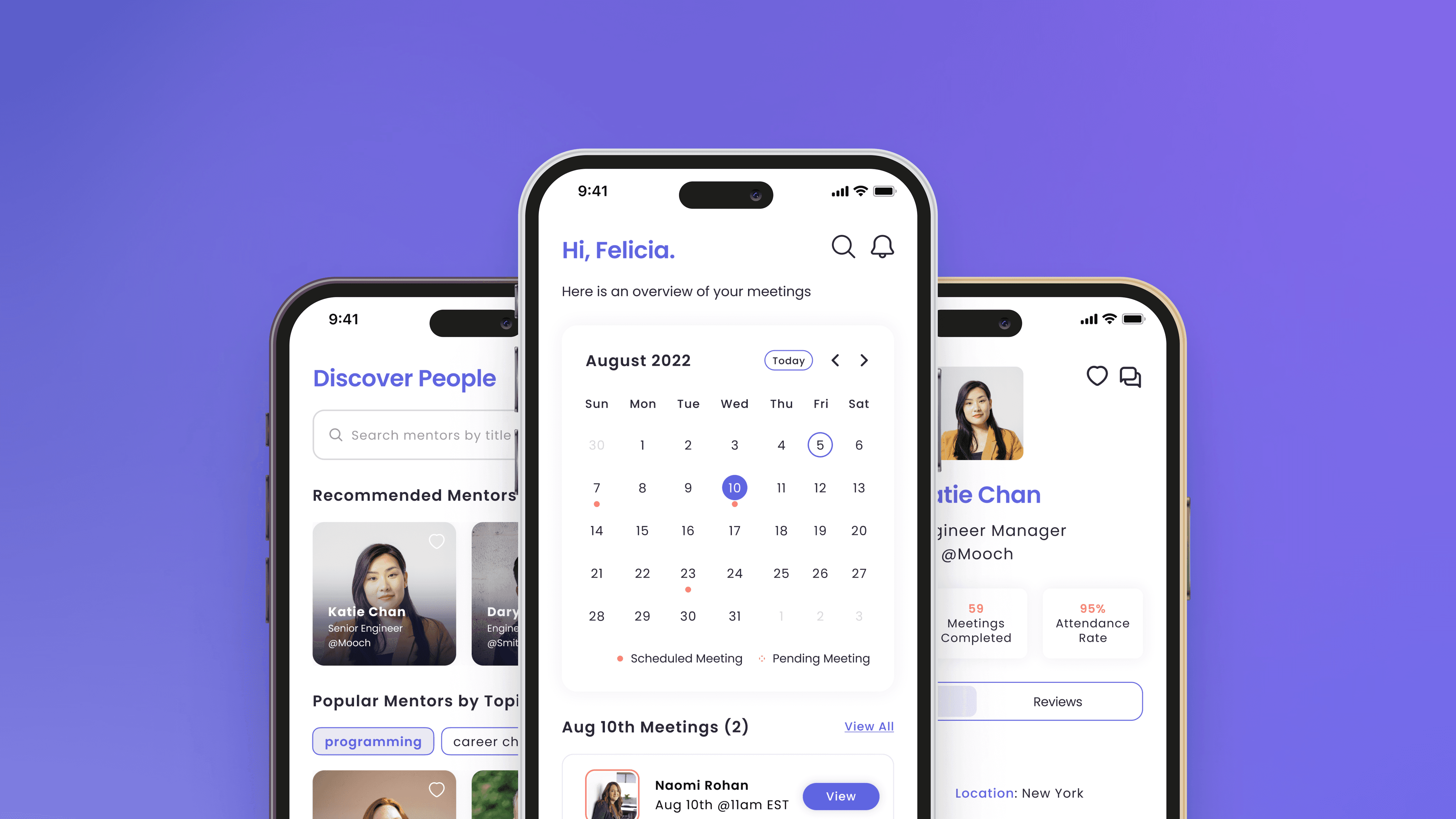
MOBILE UX DESIGN
Connectic
[2023 Indigo Design Award Winner] Improving access to mentorship opportunities for early career professionals
USABILITY TESTING | CASE STUDY
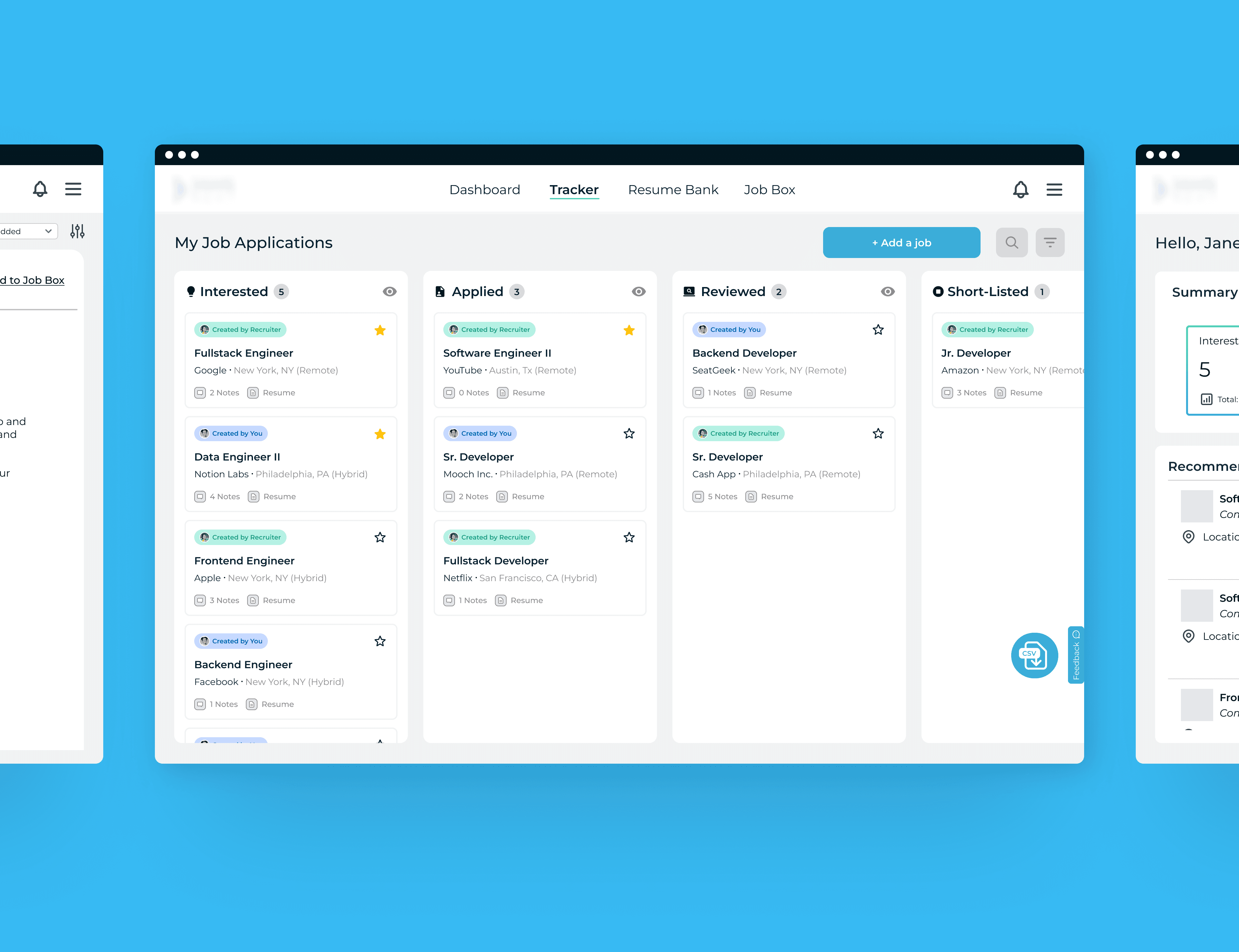
HireScoutr
Refreshing the job applicant experience for a recruitment software start-up
WEB DESIGN | CASE STUDY
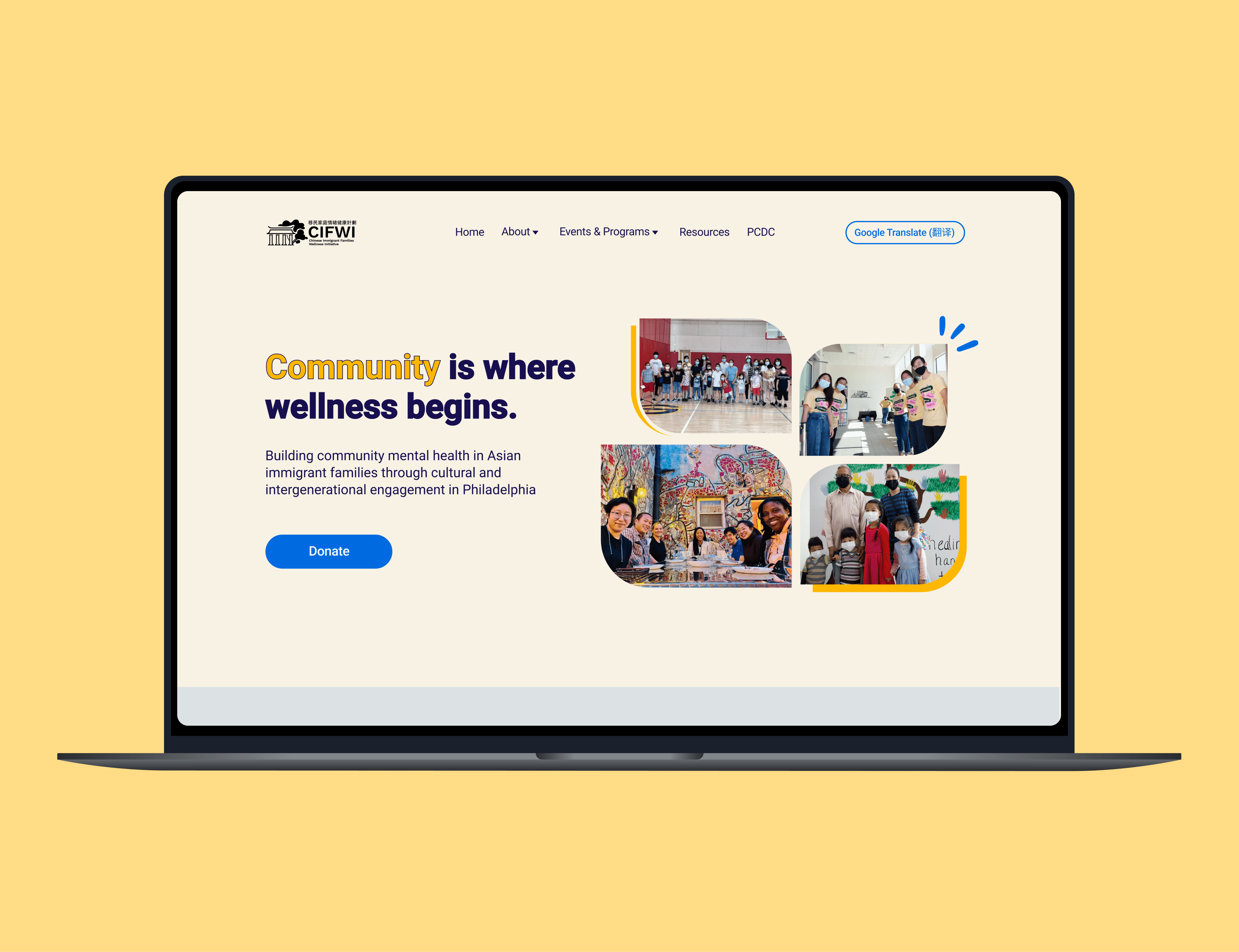
CIFWI
Homepage redesign for a mental health non-profit organization based in Philadelphia
WEB DESIGN
Leavea
Improving product comparison on a house plants e-commerce website