Category
SaaS Design
Usability Testing
UX Internship
Team
3 UX Design interns
1 Design Lead
JAMSNext's Founder
Context
March - April 2023
(2 months)
Tools Used
Figma, Calendly, GSuite
Project Brief
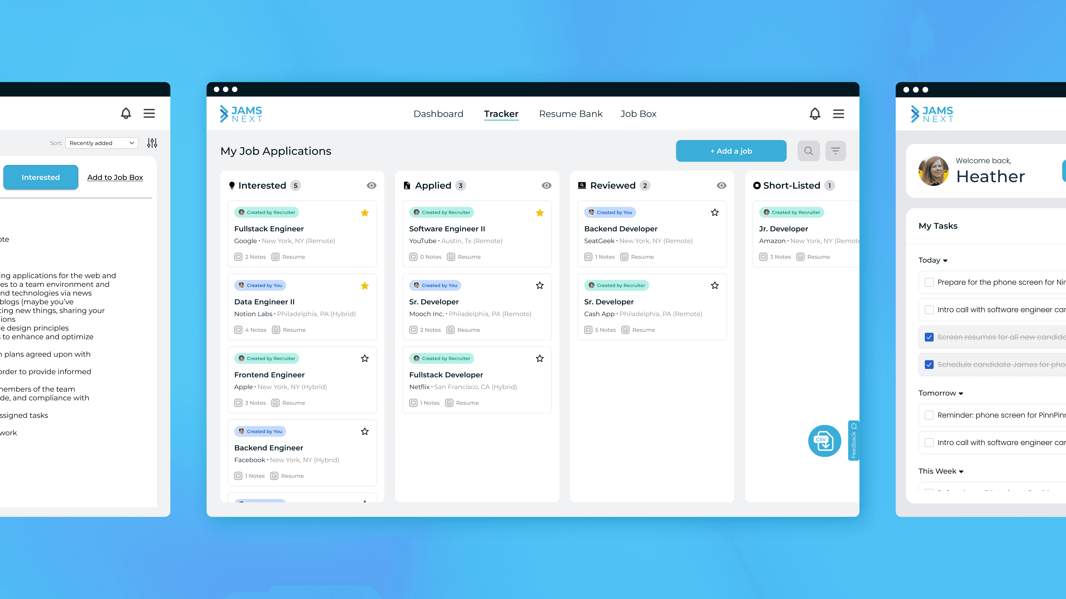
JAMSNext is a SaaS start-up that aims to streamline the job application process by providing a platform that bridges the communication gap between job applicants and recruiters.
Job applicants nowadays often don't hear back or get ghosted during the interview process, leading to stress and little return for invested time. JAMSNExt allows applicants to track their job applicantions and progress through real time recruiter updates, thus leading to a better applicant experience. In addition, JAMSNext aims to be an all-in-one hub for applicants to manage their job application process.
My Contribution
As a UX design intern, I lead the usability testing and follow-up ideation of JAMSNext's platform for their applicant user type experience.
Over the course of 5 weeks, I worked alongside two other interns, JAMSNext's CEO, and their Design Lead to write the script for usability testing, conduct the testing sessions, analyze feedback data, and wireframe design recommendations.
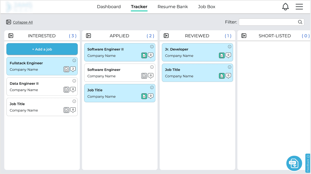
Before
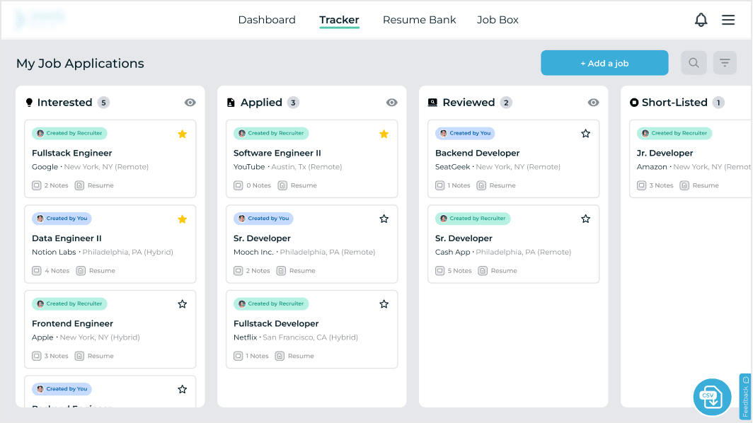
After
Initial Challenge & Approach
JAMSNext's platform had a wide breadth of offerings and multiple user types, which meant the first thing our team had to focus on was narrowing down our project scope and explaining our design process.
In our initial meeting, JAMSNext showed us a new prototype they recently made of the platform's new features with different versions for each of their user types that they wanted to get the team's input on. Given the large scope of information that was provided and the time constraints, we quickly realized the importance of setting realistic expectations as well as explaining the importance of the UX design process and its methodology.
Given my team's background and available resources, we narrowed the scope to focus on testing the user flows for the applicant user type specifically
Testing Goals
I conducted user interviews with the help of 2 other interns with 8 participants, ranging from job applicants fresh in their search process to job hunting up to a year.
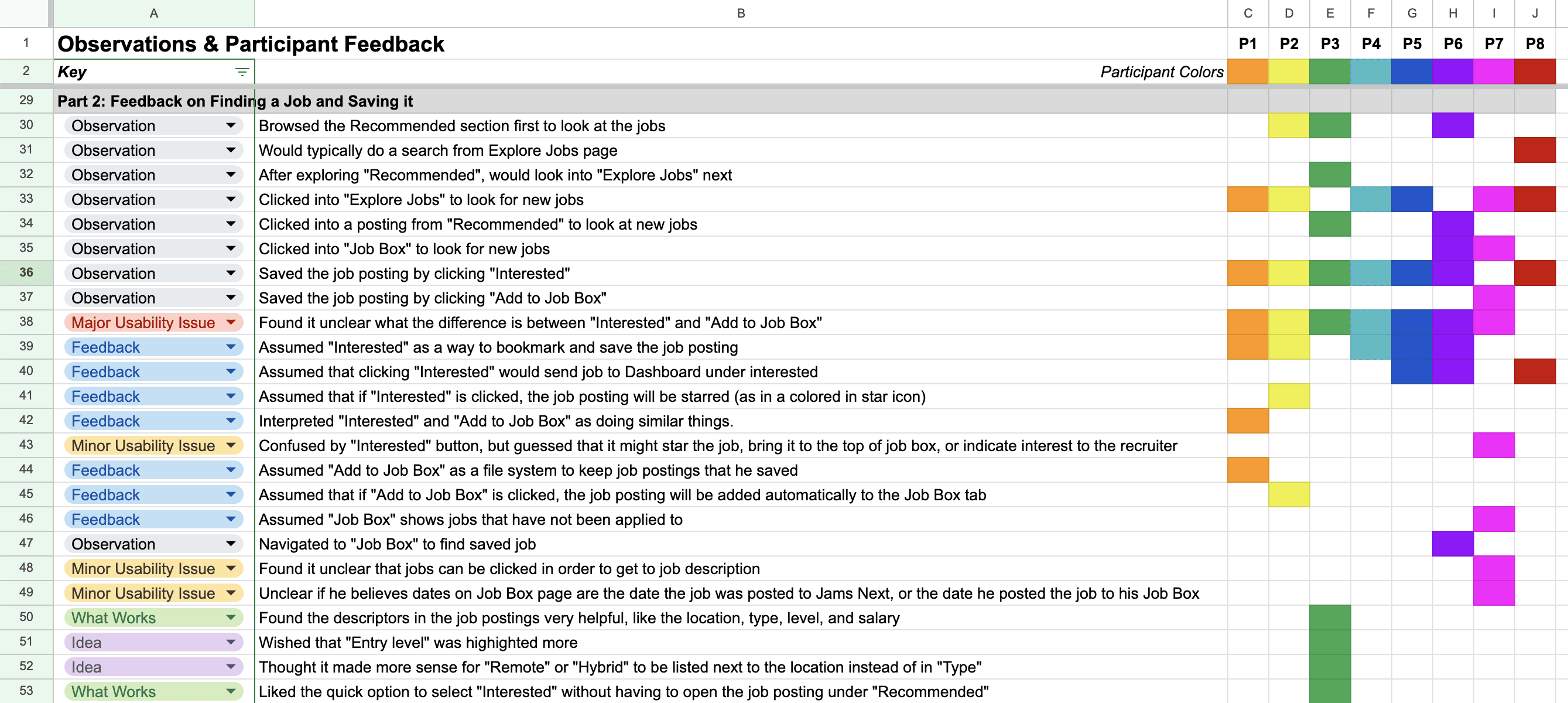
Our goal was to see whether JAMSNext's platform aligned with the needs and expectations of job applicants, and whether the platform was intuitive to use. During testing, I proposed using a rainbow spreadsheet to make collaboration easier through shared note-taking during testing with my teammates. This made it simple for us to detect user patterns and issues across each usability task, and present data to our stakeholders.
Rainbow Spreadsheet for Data
Testing Results
Feedback from our testing sessions confirmed our initial hypothesis that while users loved the concept of JAMSNext, they found aspects of the platform's navigation and UI to be confusing.
We identified 3 major usability issues during testing, which we presented to JAMSNext, as well as recommendations that we identified through collaborative ideating with sketches.
3 Major Usability Issues that Were Identified
63% of testers did not know that the tracker was scrollable, and found the layout to be a bit long with hard to read vertical text when columns were collapsed.
88% of testers had difficulty understanding the different options available when saving a job posting that they were interested in.
I really enjoyed the collaborative sketching and brainstorming process during ideation, and took on the lead in being the sole designer for bringing the sketches to life as mock wireframes.
Design Ideation 1 - Job Cards
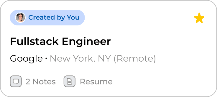
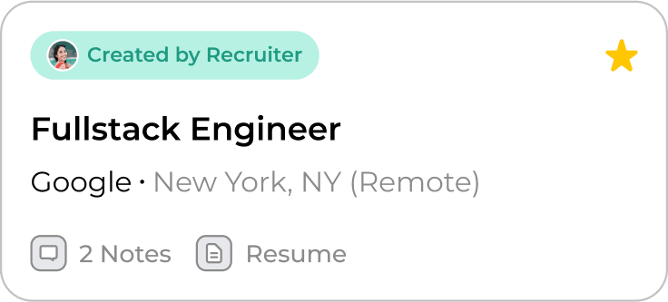
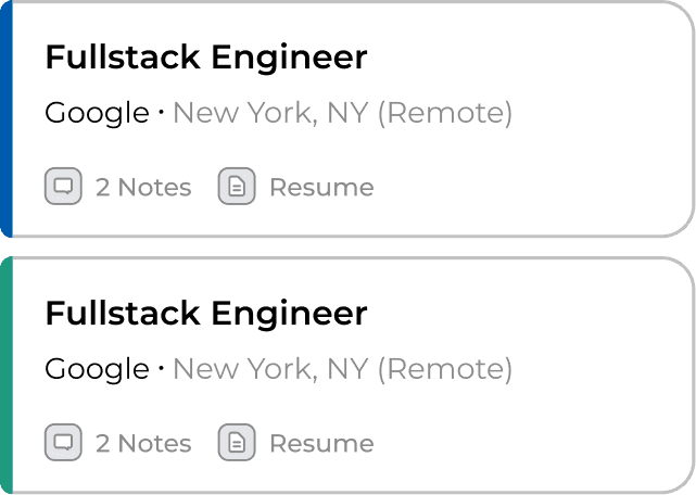
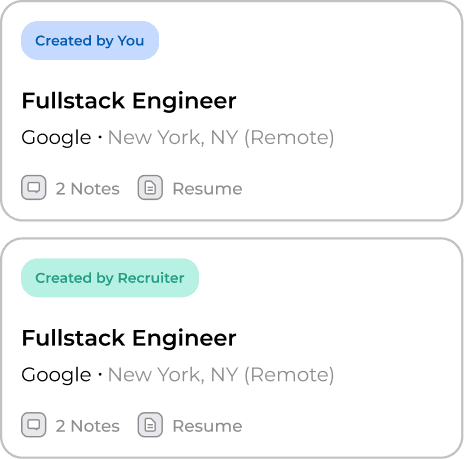
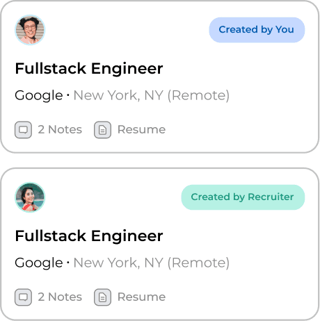
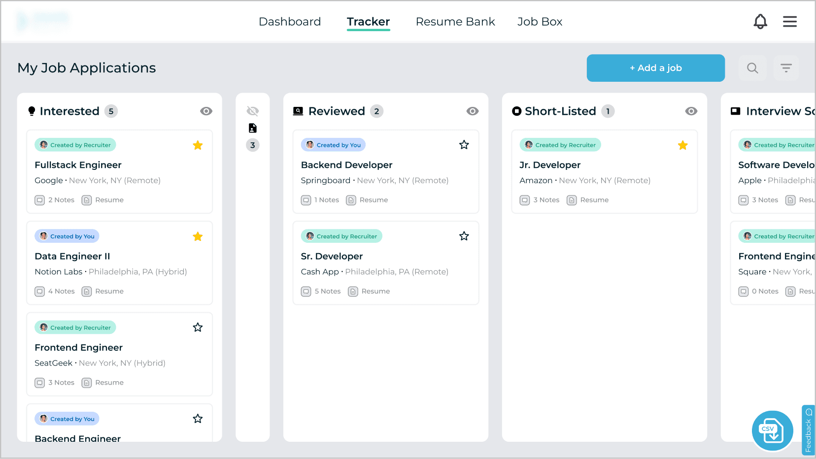
Job cards were originally color coded blue and white in the tracker to differentiate between internal and external jobs, but our testers interpreted the blue as indicators of being highlighted, new, or unread instead. To fix this, we decided to use tags to explicitly show who created the job card and thus indicate ownership in terms of which cards can be moved by the applicant.
JAMSNext initially also included an "i" icon to provide more information when hovered, but this was removed in the redesign as majority of our tester did not use it. We replaced the space with the ability to star favorite job cards and pin it to the top, allowing users to customize the ordering within the tracker's columns. We also added text to the icons for added clarity since that was also a key concern.
Blue: Internal Jobs found in JAMSNext
(Not moveable by applicants in the Tracker)
White: External Jobs Added by Applicant
(Moveable by applicants in the Tracker)
Redesigned Internal Cards
Redesigned External Cards
Past iterations that I mocked up before arriving at the current redesign included experimenting with side banners and simple profile icons as well as colored tabs.
Design Ideation 2 - Tracker Layout
Surprisingly, more than half of our testers did not know that JAMSNext's tracker was scrollable horizontally, and found it a bit too long. To improve the layout, we removed the vertical text and experimented with both icons and colored dots to show what the collapsed columns referred to.
We also changed the icon use show and hide “eye” icons, as it was more widely recognized. To avoid awkward blank columns, we proposed moving hidden (collapsed) columns to the end of the tracker for greater flexibility for our users.
Old Collapse
Updated Collapse
Updated Design for Tracker
Design Ideation 3 - Job Box
When asked to save a job posting, we found that our testers typically selected "Interested" as their go to option, and expressed confusion around having multiple options. This lead to a deeper conversation within the team on clearly defining the exact purpose of the "Job Box" so that it did not overlap with "Interested."
Additionally, due to the confusion of “Job Box” during testing, we also recommended changing “Job Box” to a more descriptive title or adding an onboarding process to provide more context to users. Due to time constraints, we did not have mock-ups for this usability issue, but passed on the feedback to HireScoutr's team.
Current Job Postings Page - Saving Options
3 things that I learned and/or would do differently next time…
Be prepared to explain the UX process to non-UX individuals - After the initial meeting, I quickly realized that our stakeholder was not familiar with the design process, which highlighted the importance of being able to articulate the value of conducting research and validating design assumptions. As a result of this experience, I feel more prepared in tackling these types of conversations in the future, as well as managing stakeholder expectations when there is a lot of flexibility in a start-up environment.
Two heads are certainly better than one - My favorite part of this project was collaborating with my team members during ideation when we bounced around redesign ideas to sketch out. Sometimes it's easy to get caught up in your own ideas, but I found that being open to discussing various angles to a problem often led to the most ideal solution.
If I had more time, I would love to see our design recommendations to implementation - This means conducting a second round of testing to validate that the changes have improved user usability, and working with the developers to understand any technical constraints when building out new design features.
MOBILE DESIGN
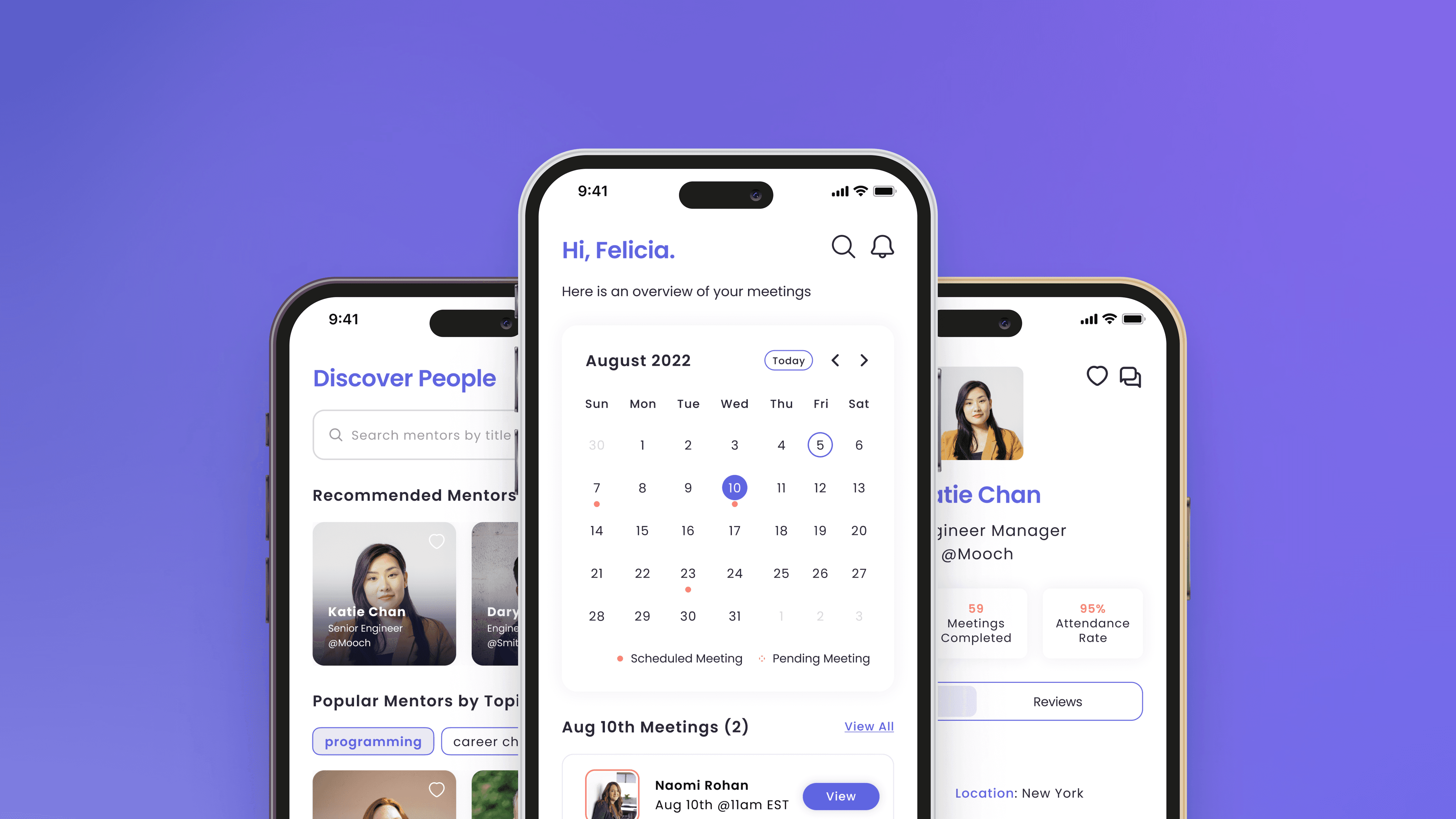
Connectic
[2023 Indigo Design Award Winner] Improving access to mentorship opportunities for early career professionals
WEB DESIGN
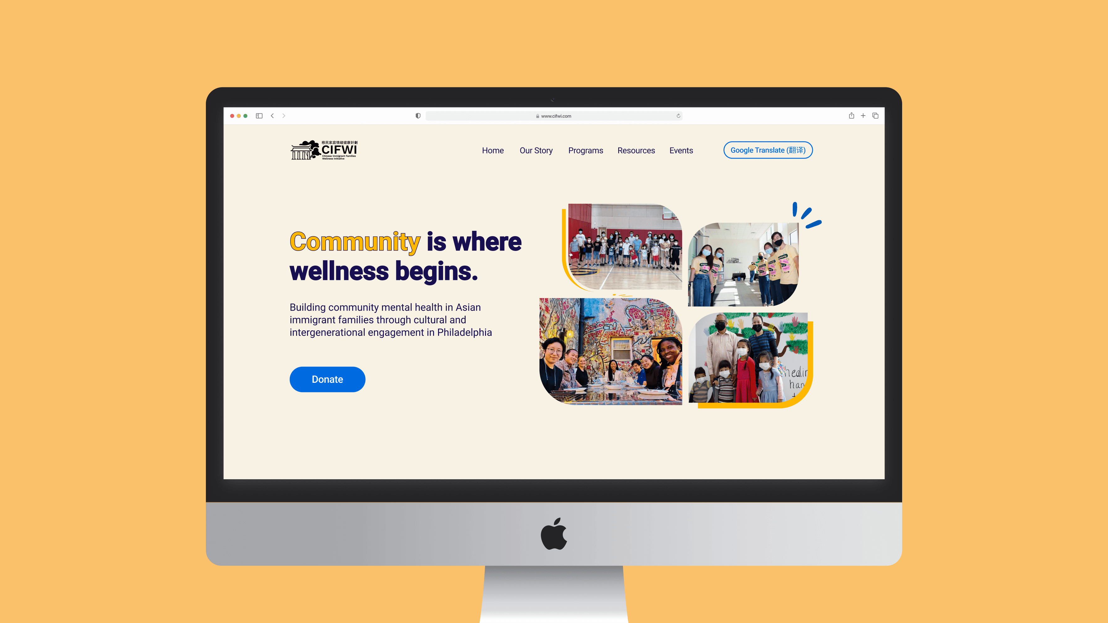
CIFWI
Homepage revamp for a mental health non-profit organization based in Philadelphia
OTHER | FREELANCE
Miscellaneous
A gallery of other side projects I've worked on in the past, including freelance client work and design sprints.

