CIFWI
Role
UX/UI Designer
Team
Director of CIFWI
Illustrator
WordPress Consultant
CIFWI Volunteers
Timeline
Jan - Jul 2022
(7 months)
Skills
User Research
UX Design
Web Design
Project Management
Tools Used
Figma
Google Analytics
WordPress
CONTEXT
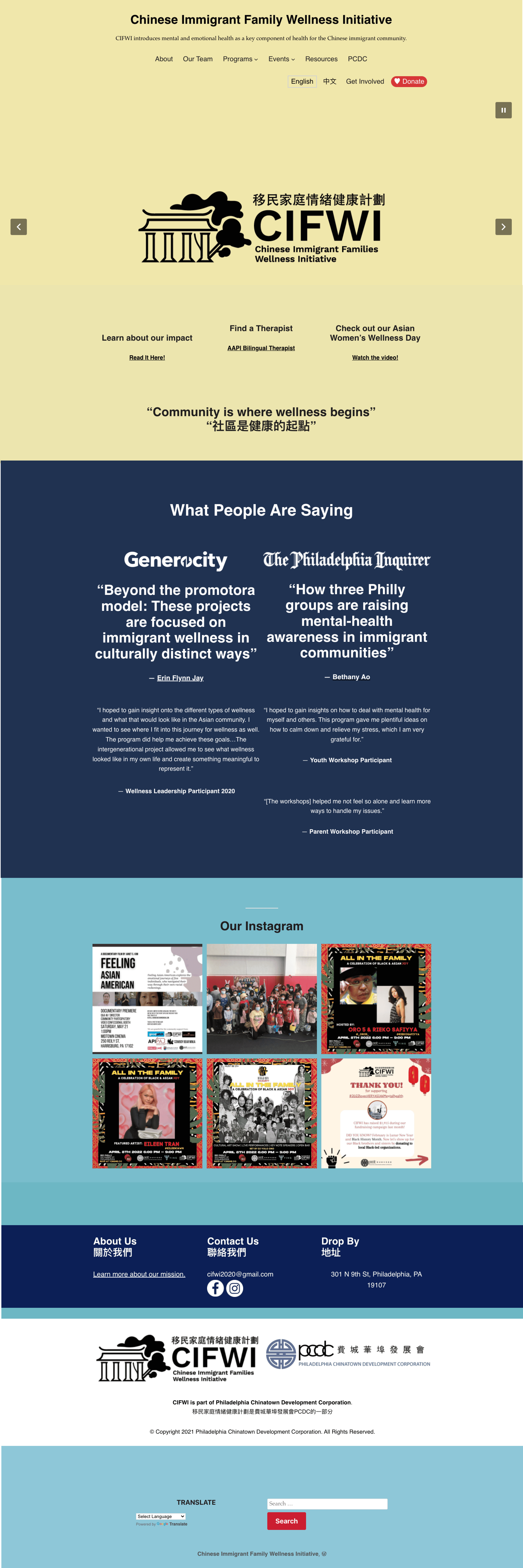
Launched in 2020, CIFWI is a non-profit that bridges the gap in mental health services for Philadelphia’s Asian immigrant community. Despite having valuable resources, CIFWI struggled to engage with its community, prospective volunteers, and donors due to its outdated website.
As the sole UX/UI Designer, I led the user research, design, and implementation of the website revamp, while also working closely with CIFWI’s Director and a team of 5 to rehaul the non-profit’s branding. The new website is currently live in WordPress.
SNEAK PEAK SUMMARY
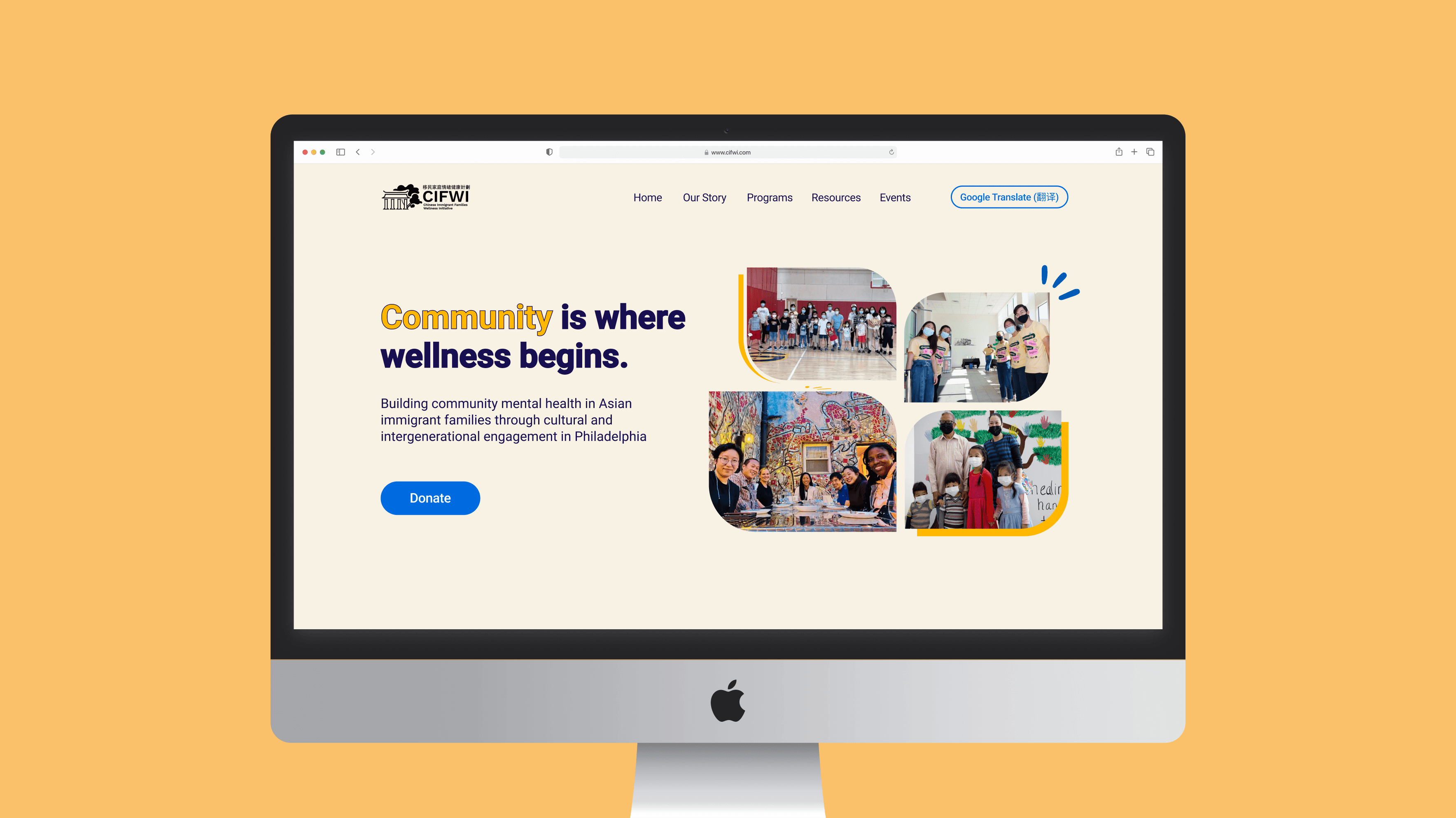
Since launch, the revamped website has resulted in a 54% increase in average user engagement time.
The redesign incorporates updated branding reflecting CIFWI’s mission and values – diverse, welcoming, and community-oriented – while intuitively highlighting its resource programming and engagement opportunities for easier access.
Redesigned Home Page
THE PROBLEM AT HAND
CIFWI's outdated website did not accurately reflect the non-profit's mission and resource offerings, which hindered its ability to connect with the community.
There was a disconnect between how much CIFWI had to offer versus how little of it was presented on its website. At a glance, it was hard to tell what CIFWI did as an organization, with little light shed on its vast programming on mental health advocacy, various support groups, and available resources. This led to 3 different goals for the redesign.
Concerns from CIFWI's 3 User Types
Immigrant community members want easy access to CIFWI’s mental health resources, but they are scattered on the website
Prospective donors want to learn about CIFWI's mission and donate to the non-profit, but it's difficult to understand what CIFWI does from the website
Prospective volunteers want to get involved with CIFWI, but cannot find information on how to do so exactly from the website
This Led to the 3 Redesign Goals
Improve the overall UX of the website by highlighting CIFWI’s available resources, especially its AAPI Therapist List
Improve people’s understanding of CIFWI through 1) updated branding and 2) a clear mission statement to accurately reflect the organization through the website
Increase the ease of engagement and donations for volunteers and donors through clear call to actions on the website
CRITICAL VARIABLES
Early on in the project, we had to pivot and prioritize the homepage as the new scope for the redesign, after assessing team capacity and resources.
Initially, we had a full site-wide revamp in mind for the project scope. However, further discussion revealed a large amount of content revision needed to support a project of that scale, which the team did not have the capacity for. Therefore, we strategically shifted the UX plan to a homepage-first revamp with built-in flexibility for future information architecture refinements, as a starting MVP update.
The Redesign Process, with Narrowed Scope
Heuristic Analysis
Google Analytics
User Interviews
Site Map Update
Iterative Wireframing
Web Copy Overhaul
UI Style Guide
Illustrator Collaboration
WordPress Implementation
01
Understanding the Existing Website
A BASELINE ANALYSIS
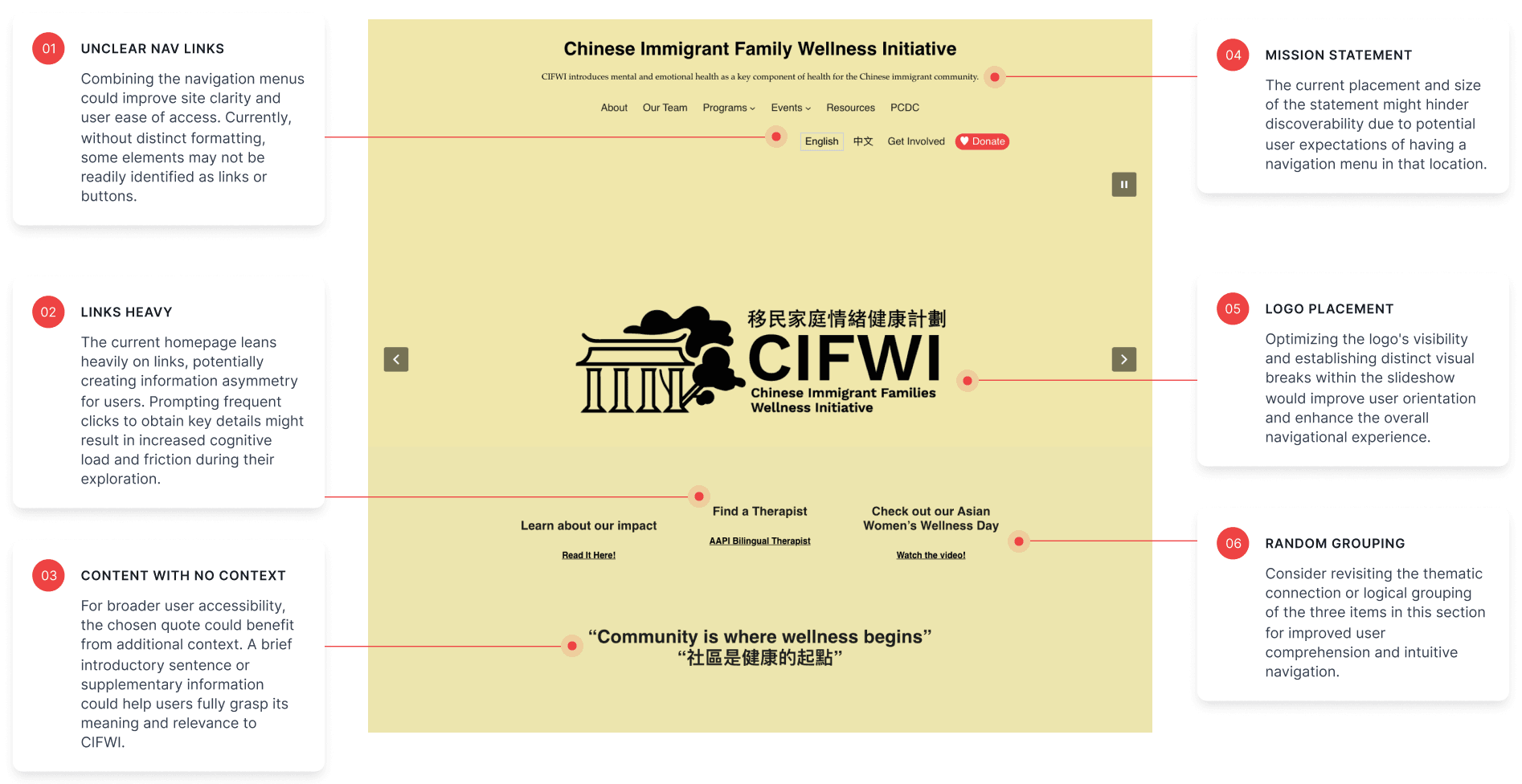
A heuristic assessment highlighted 3 glaring issues on the homepage: 1) overuse of links 2) minimal content about CIFWI, and 3) an unclear user journey with no CTA.
Analyzing CIFWI's website against established design principles revealed several concerns about its layout, UI choices, and navigation. The homepage, comprised mainly of links to other pages, offered minimal information to users making it difficult to find essential details. Highlighting these issues convinced stakeholders to prioritize a deeper overhaul over a simple UI branding update.
CULTURAL DESIGN DIFFERENCES
Surprisingly, insights from Google Analytics then revealed a predominately younger user demographic, challenging initial stakeholder assumptions and design direction.
Until this point, the target audience for CIFWI's website was assumed to be older millennials. As such, the Director envisioned an "Eastern" web redesign style with high information density, known to resonate with Asian millennial web habits. However, the data unexpected pointed to a majority younger demographic traffic. This became the key argument for proposing a more modern design direction tailored to this younger audience.
Other Key Insights from Analytics
The Home Page, Team Page, and The Wellness Leadership Program took up majority of user views.
[Follow-Up Ques]: The Wellness Program attracts a lot of traffic. Should it be highlighted on the home page?
English was the predominant user language, contrary to our initial assumption of equal split with Chinese.
[Follow-up Ques]: Is it still optimal to maintain duplicate web pages in both Chinese and English?
02
Getting Feedback Directly from Users
INTERVIEWING CIFWI MEMBERS
"The current site is like a thesis paper without the thesis statement. The intention is there, but fragmented."
I interviewed 4 diverse members of CIFIW to explore their user experience, including how they navigated the site, formed their impressions of CIFWI based on the information available, and any usability challenges they faced. The majority of feedback highlighted a lack of clarity about CIFWI's core functions and offerings, influencing our homepage restructuring approach to actively inform users about key information and resources.
What CIFWI's Users Wanted
A greater visual balance: Outdated aesthetics and a text-heavy homepage fail to visually engage users and detract from information clarity
Links grouped by resource type, by audience type, or by most popular offerings: Incongruent link placements throughout the homepage impede intuitive navigation and user engagement.
More content directly on the homepage: A lack of concise, impactful messaging hindered users' ability to quickly and accurately understand CIFWI's mission and offerings.
03
A Rehaul and Wireframing
WEB COPY REHAUL
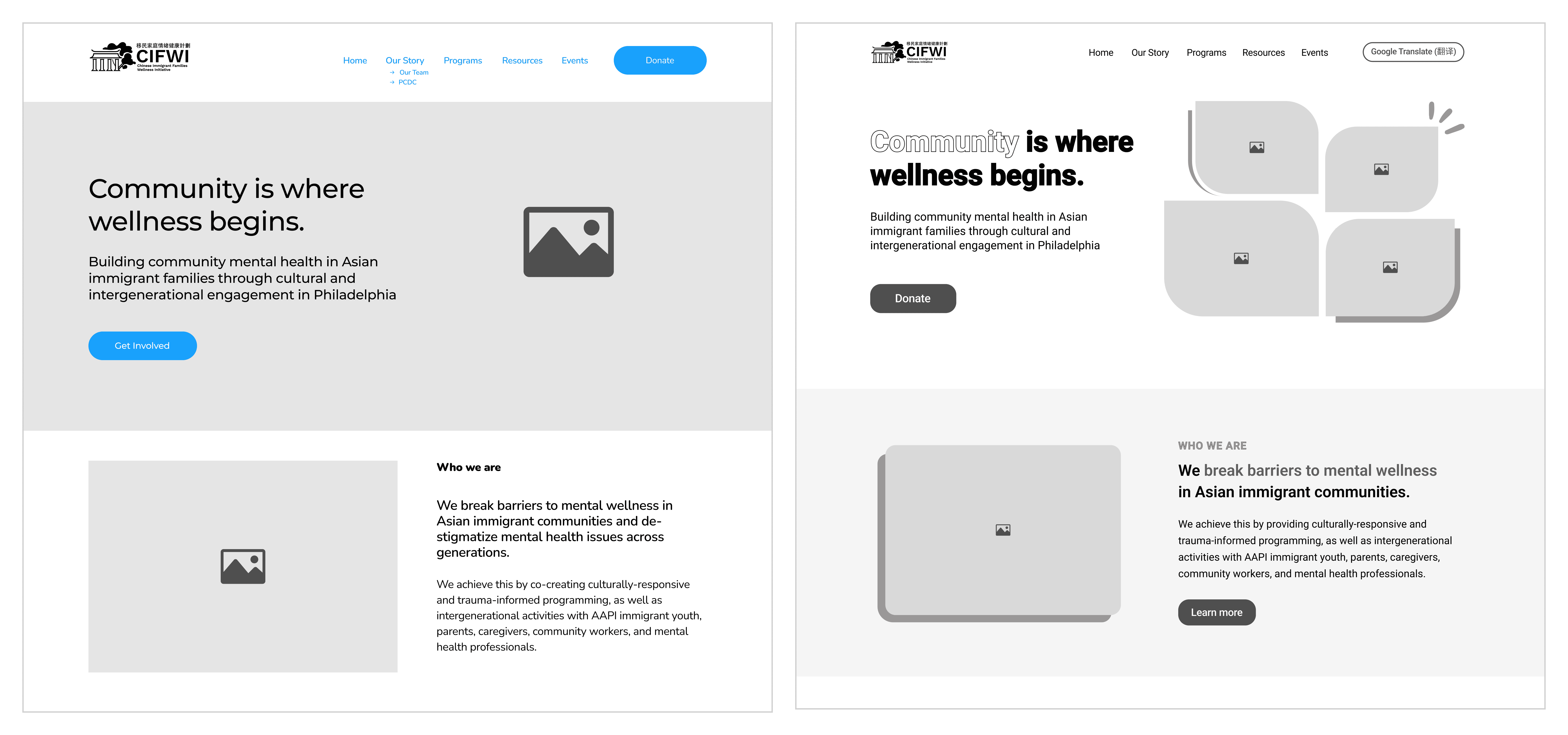
With CIFWI lacking marketing materials, I undertook a branding rehaul, crafting impactful web copy prioritized for clarity, conciseness, and reader-engagement.
I worked closely with CIFWI’s director to craft an impactful tagline, clear organizational descriptions, and engaging summaries of CIFWI's mission, values, and offerings. Condensing information for user-friendly homepages without overwhelming visitors proved the biggest challenge. Balancing accuracy, conciseness, and intrigue in the copy, guided by best practices, ultimately ensured a compelling user experience.
ITERATIVE WIREFRAMING
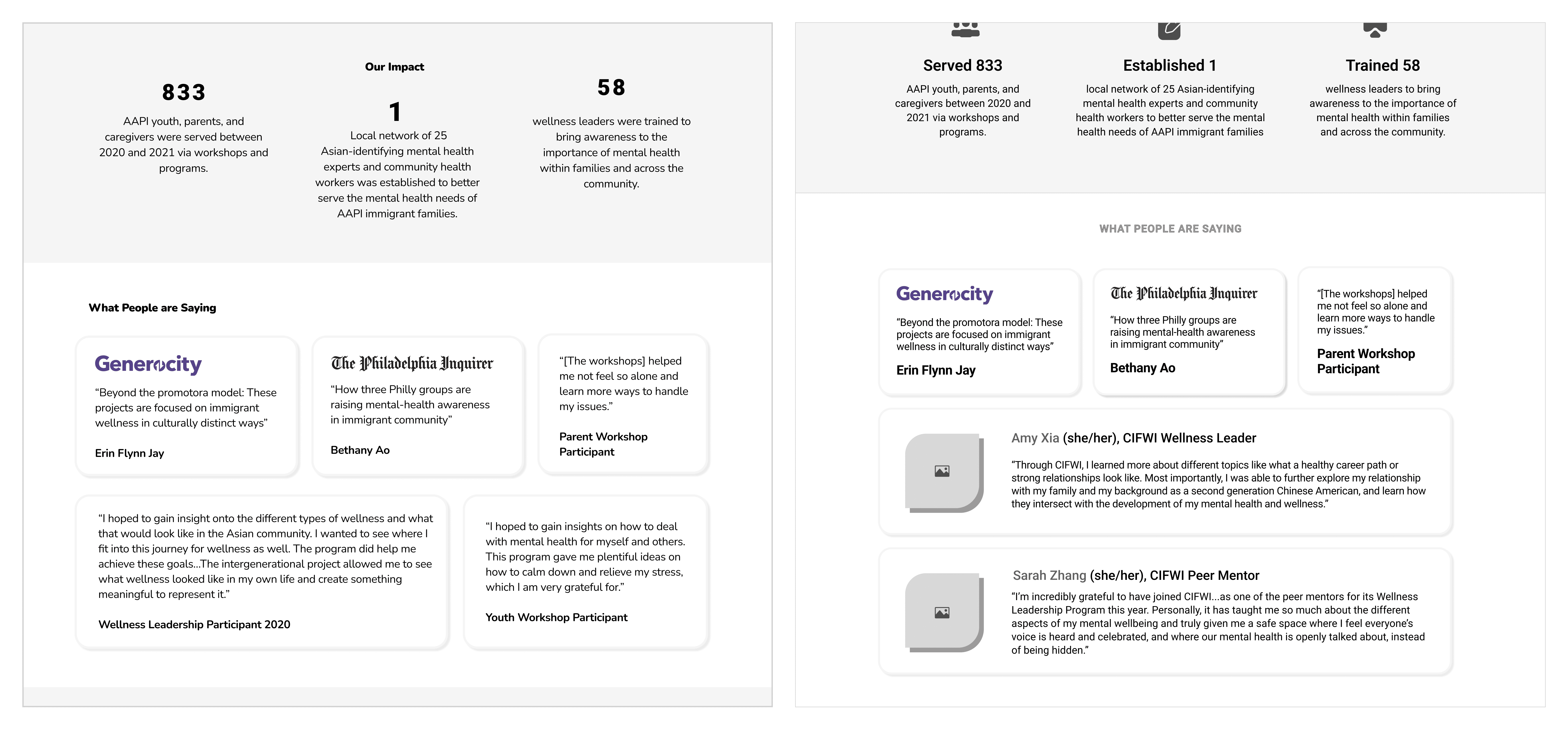
To streamline the user journey, multiple iterations of wireframing took place to prioritize accessing key information in fewer clicks.
Recognizing the link between clicks and user frustration, I redesigned the sitemap to significantly shorten user journeys. Fewer clicks to key information, inspired by best practices, translate to smoother, more satisfying experiences.
04
Defining the New Branding
A COMMUNITY FOCUSED BRANDING
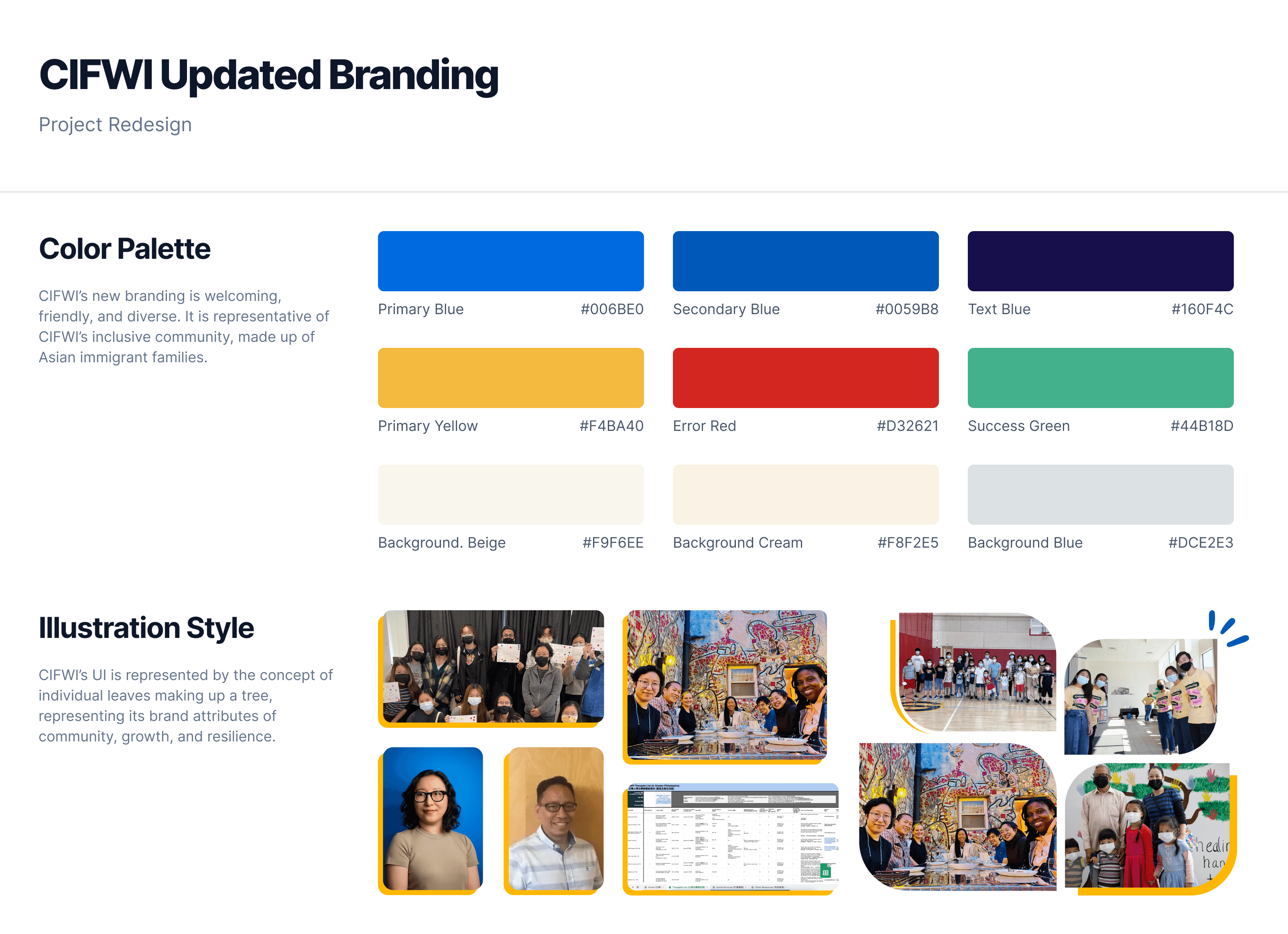
Finalized through polling the CIFWI community, the new UI features a palette of blue and yellow, culminating in a branding that is welcoming, friendly, and diverse.
Working within a limited palette of yellow, blue, and red, I led a collaborative UI redesign for CIFWI that deeply engaged the community. Polls and feedback helped us shift towards a welcoming blue and yellow palette, leaving red behind due to concerns about its negative associations. We also chose the leaf as a symbol of diverse individuals coming together to form a vibrant community (a tree). This inclusive design process ensures a UI that truly reflects CIFWI's unique and diverse identity.
ILLUSTRATOR COLLABORATION
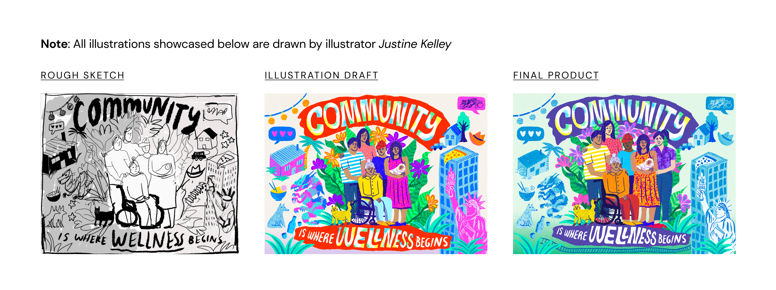
In the process of creating UI assets, I outreached and worked with a local artist to visually capture CIFWI’s mission.
To visually represent CIFWI's mission of mental health advocacy within Asian immigrant communities, we collaborated with freelance illustrator Justine Kelley. Over several weeks, I worked with Justine by brainstorming conceptual ideas and driving the direction of the illustration piece through multiple feedback sessions. We ultimately landed on the impactful illustration shown below, now featured on the homepage.
05
Implementation into WordPress
WORDPRESS IMPLEMENTATION
Four key design adjustments were made after facing some technical constraints in CIFWI's existing WordPress template during implementation.
CIFWI's website, built on a basic WordPress template with limited customization options, presented design challenges both layout-wise and stylistically. Recognizing this, we strategically focused on optimizing its layout and stylistic elements within its constraints. By leveraging the existing framework and collaborating with a WordPress developer, I delivered a website refresh that balances design impact with long-term maintainability.
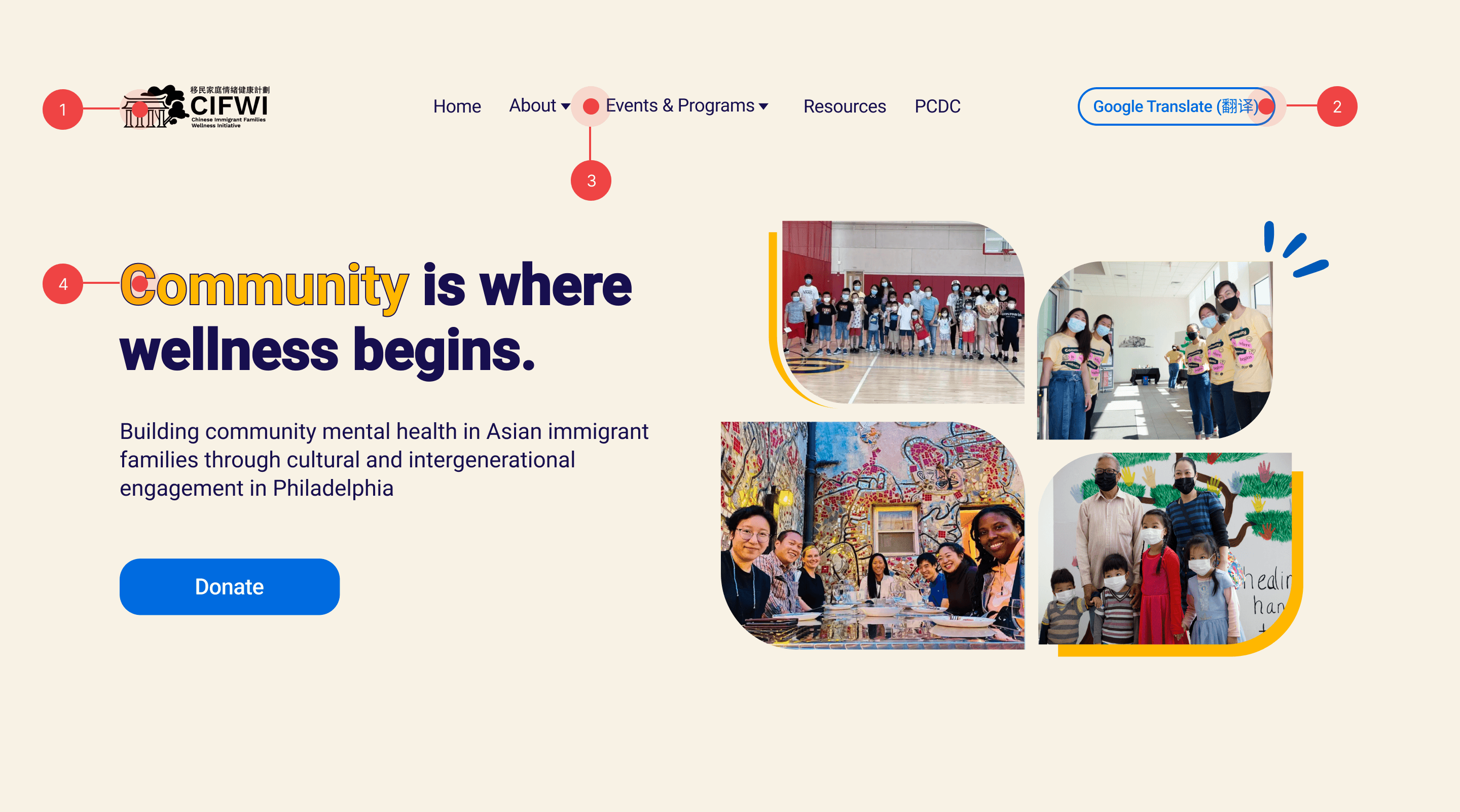
Pre-Implementation Design
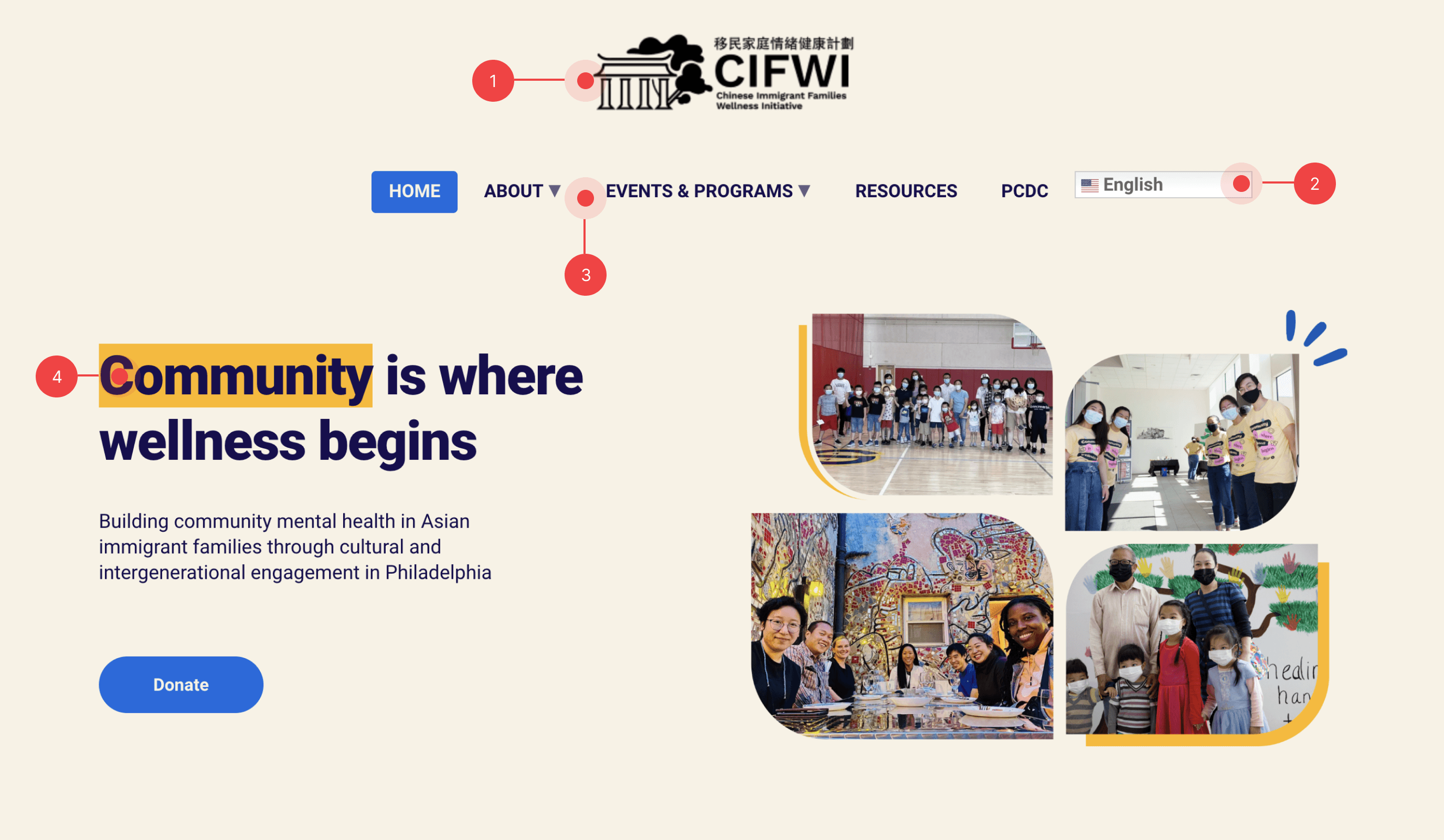
Post-Implementation Changes
Logo Placement
Due to template limitations, the logo had to be centered. Further layout flexibility would have offered more design possibilities.
Google Translate Plugin
To ensure compatibility with the existing template, the Google Translate plugin maintained its default visual appearance. Alternative solutions for seamless UI integration are being explored for future enhancements.
Navigation Menu
The template's preset navigation menu limited customization options. While this ensured user familiarity, future iterations could benefit from greater UI flexibility.
UI Text Styling
The lack of native options for color-coding and word outlining necessitated shifting to highlight effects to emphasize key information. Future considerations include investigating custom code solutions for greater styling control.
FINAL PRODUCT
Want to check out the redesigned CIFWI website yourself?
The current redesign is live on CIFWI's website. Please note that there may have been some updates due to continuous website maintenance.
"Shirly helped revamp our organization's website (www.CIFWI.com). She is creative, detail-oriented, responsible, collaborative, and truly a joy to work with. Throughout the 6-month project, Shirly conducted a comprehensive website assessment, developed a timeline with realistic goals and target dates, organized meetings with multiple project partners including the illustrator, web developer, program participants, and supporters. She created and implemented the new design of our website. We cannot be more happy with the final product, as the website accurately reflects the culture of our organization."

Esther Hio-Tong Castillo
Director of CIFWI
CONCLUSION
3 things that I learned and/or would do differently next time…
Get input from and involve the engineers early on in the design process - Through this project, I recognized the importance of integrating technical feasibility discussions throughout the design process. Early collaboration with the WordPress web developer would have prevented potential roadblocks related to template limitations later in the workflow.
Everyone has assumptions, so it's always important to advocate for the user - While design collaborations can involve differing viewpoints, I've learned that leveraging user research fosters a collaborative environment. By grounding design decisions in data-driven insights, I can effectively address client concerns while ensuring user-centric solutions.
If I had more time, I would do additional user testing to gather feedback on the redesign - Prioritizing rapid implementation for this project resulted in the decision to postpone user testing. While time constraints limited formal user testing during the redesign phase, conducting post-launch user studies will provide valuable insights for ongoing optimization and further refine the redesign's effectiveness based on user feedback.
Thank you for reading! 📖
If you have any questions for me or about my work, feel free to reach out to shirlyliu26@gmail.com.
MOBILE DESIGN
Connectic
[2023 Indigo Design Award Winner] Improving access to mentorship opportunities for early career professionals
SAAS DESIGN
JAMSNext
Refreshing the job applicant experience for a recruitment software start-up
OTHER | FREELANCE
Miscellaneous
A gallery of other side projects I've worked on in the past, including freelance client work and design sprints.

